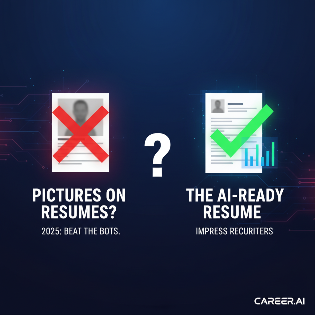
Should You Use Pictures of Resumes? A 2025 Guide to What Recruiters Want
Should You Use Pictures of Resumes? A 2025 Guide to What Recruiters Want
Meta Description: Wondering if pictures of resumes are a good idea? Discover why photos can hurt your chances and learn what a professional resume should really look like in 2025 to beat the bots and impress recruiters.
Introduction: The Resume Design Dilemma
You've spent hours perfecting your resume, but one question remains: what should it look like? You see countless visually stunning templates online, complete with headshots, intricate graphics, and bold colors. You might even be tempted to use one of those "pictures of resumes" as your guide. But in the competitive 2025 job market, will a creative design help you stand out, or will it knock you out of the running before a human even sees your application?
This guide cuts through the confusion. We'll explore why a picture on your resume is usually a bad idea, what applicant tracking systems (ATS) and recruiters actually want to see, and how to format your resume for success.
The Big Question: Should You Include a Picture on Your Resume?
The short answer for job seekers in the U.S., UK, and Canada is a firm no. Here’s why:
1. The Bias Barrier
Most companies have strict policies against including photos on resumes to avoid potential discrimination claims based on age, gender, race, or appearance. Submitting a resume with a photo can make you look unprofessional and unaware of modern hiring practices. In fact, a report found that 88% of recruiters in the US would reject a resume with a headshot to avoid bias TeamStage Report.
2. The ATS Roadblock
Applicant Tracking Systems (ATS) are the gatekeepers for over 95% of large companies. These systems scan and parse your resume's text to determine if you're a good match for the role. Unfortunately, they can't read images.
What an ATS sees when it scans a resume with a picture:
- A blank space
- A jumbled error
- A parsing failure that can lead to your entire resume being misinterpreted or discarded.
When is a Resume Photo Acceptable?
There are a few exceptions to the "no photo" rule:
- Certain International Markets: In some countries, particularly in Germany and parts of Asia, a professional headshot is still a common practice. Always research local customs.
- Acting or Modeling: In these professions, your headshot is a critical part of your submission.
- Direct Instructions: If the job application explicitly asks for a photo, you should provide one.
Beyond Pictures: What Makes a Resume Look Professional in 2025?
A professional-looking resume isn't about fancy graphics; it's about clarity, readability, and being ATS-friendly.
| Feature | The Good (ATS-Friendly) | The Bad (Gets Rejected) |
|---|---|---|
| Layout | Single-column, clean, with clear sections. | Multi-column layouts, text boxes, or tables. |
| Fonts | Standard fonts like Calibri, Arial, or Times New Roman (10-12pt). | Script, decorative, or custom fonts. |
| Graphics | None. Use standard bullet points. | Icons, skill bars, logos, or background images. |
| File Type | PDF or .docx, as specified in the application. | .jpg, .png, or other image formats. |
Key Elements of a Winning Resume Layout:
- Wide Margins: Use 0.5 to 1-inch margins to create white space and prevent a cluttered look.
- Standard Section Headers: Use clear, predictable titles like "Work Experience," "Education," and "Skills."
- Consistent Formatting: Keep your font, font size, and date formats consistent throughout the document.
- Action Verbs & Quantifiable Results: Start bullet points with words like "Managed," "Achieved," or "Increased," and back them up with numbers (e.g., "Increased sales by 15% in 6 months").
Don't Just Build a Resume, Build an ATS-Beating Resume
Feeling overwhelmed? You don't have to be a design expert to create a resume that gets results. JobSeekerTools offers an AI-powered resume scanner that analyzes your document against the job description, identifying keywords you're missing and formatting issues that could get you rejected.
[CTA: Optimize Your Resume for Free with JobSeekerTools!]
Conclusion: Substance Over Style
While it's tempting to use visually appealing "pictures of resumes" as a template, the reality of modern hiring is that substance and scannability trump style. For most job seekers, leaving your photo off is the safest and most professional choice. Focus on creating a clean, well-structured, and keyword-optimized document that highlights your skills and achievements. This approach will ensure your resume impresses both the ATS bots and the human recruiters, getting you one step closer to your dream job.
Key Resources
Anatomy of a Perfect Resume
This guide breaks down the ideal resume structure to ensure it's professional, readable, and ATS-friendly.
Key Sections
A well-structured resume should include the following sections in a clear, logical order:
- Contact Information: Name, Phone Number, Email, and LinkedIn Profile URL.
- Resume Summary or Objective: A brief 2-3 sentence overview of your career goals and qualifications.
- Work Experience: A chronological listing of your relevant jobs, with bullet points detailing your accomplishments.
- Education: Your degree, university, and graduation date.
- Skills: A dedicated section for your technical and soft skills.
Formatting for Success
Recommended Fonts
Choose a professional and easy-to-read font. Avoid overly decorative or script fonts.
- Recommended: Calibri, Arial, Times New Roman
- Font Size: 10-12 points for body text.
Optimal Margin Sizes
Proper margins ensure your resume is easy on the eyes and doesn't look cluttered.
- Top, Bottom, Left, and Right Margins: 0.5 to 1 inch.
Infographic showing the anatomy of a perfect ATS-friendly resume, with sections for contact information, summary, skills, experience, and education clearly labeled.
Resume Format: Before & After
This guide provides a side-by-side comparison of a resume that is not optimized for modern hiring practices and one that is ATS-friendly and professional.
Before: The Creative Resume
The "Before" resume often includes elements that, while visually appealing, can hinder its effectiveness in an automated screening process.
- Cluttered Layout: Two-column layouts can confuse Applicant Tracking Systems (ATS).
- Profile Photo: Photos can introduce bias and are often filtered out by ATS.
- Graphical Skill Bars: Skill ratings with bars or stars are not readable by ATS.
- Creative Fonts: Ornate or script fonts can be difficult for both humans and machines to read.
After: The ATS-Friendly Resume
The "After" resume is clean, professional, and structured for both readability and machine parsing.
- Single-Column Layout: A clean, single-column format ensures information is read in the correct order.
- Standard Fonts: Professional fonts like Calibri, Arial, or Times New Roman are easy to read.
- Clear Section Headers: Bold and clear headers for "Work Experience," "Education," and "Skills" make the resume easy to navigate.
- Text-Based Content: All information, including skills, is presented as text, ensuring it is fully parsable by ATS.
Side-by-side comparison of a bad resume format (creative, with photo) and a good resume format (ATS-friendly, text-based).
Frequently Asked Questions (FAQ)
Q1: Can I put my LinkedIn profile URL on my resume instead of a picture? A: Absolutely! Including your LinkedIn URL is highly recommended. It allows recruiters to see your professional profile (which often includes a photo) at their discretion, without forcing them to confront potential bias during the initial screening.
Q2: What if I have a large gap in my work history? Should I use a different format? A: If you have a significant employment gap, a hybrid or combination resume format can be effective. This format starts with a strong skills summary or "Areas of Expertise" section to highlight your qualifications before diving into your chronological work history. However, avoid a purely functional resume, as recruiters are often suspicious of them.
Q3: Is it okay to use a little bit of color on my resume? A: A conservative use of color (like for your name or section headers) is generally fine and can add a touch of personality. However, stick to one subtle color and avoid using it for body text. When in doubt, black and white is always the safest option.